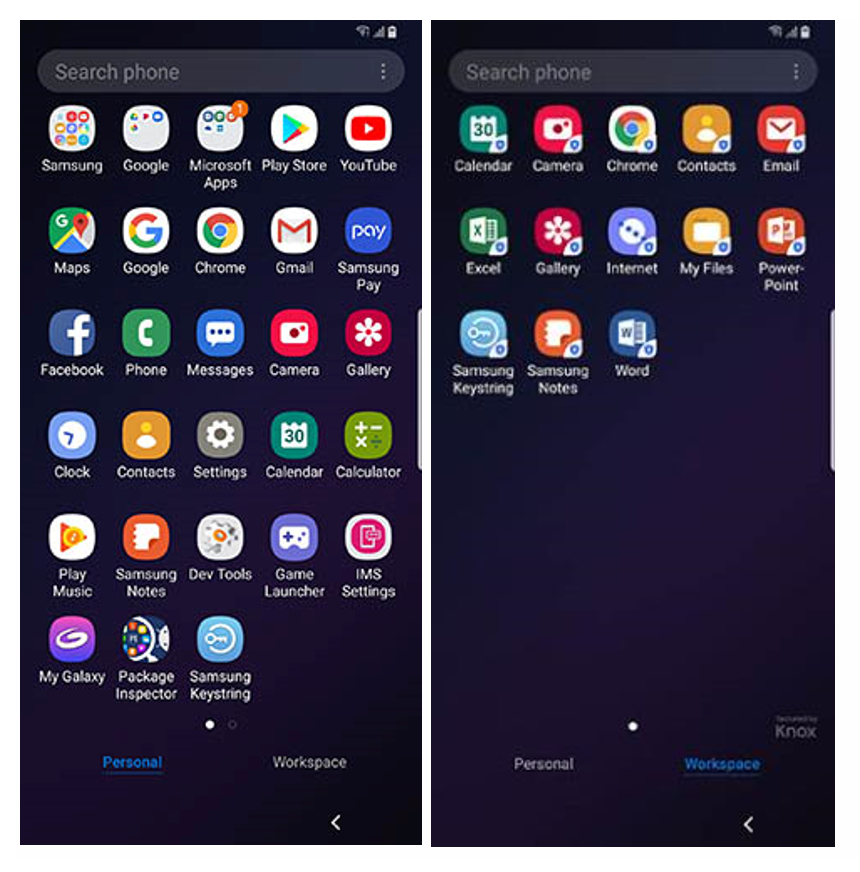
The layout of Knox Workspace 3.2.1 has changed – for the better! Knox now uses a tabbed UI to show personal and work apps, which aligns with the app drawer changes in Android P.
This enhancement benefits IT Administrators and device-users in the following ways:
- Reduces the number of IT support calls caused due to user confusion and other issues.
- Improves end-user experience and usability for users in these ways:
- Lets end-users seamlessly switch between personal and work apps without delay.
- Shows work apps in a separate tabbed view to provide a visual confirmation that the user is in the Knox Workspace.
Android P Knox Workspace Tabbed UI view
Here is the new tabbed UI.
Notice how there is a Personal and Workspace tab – simply tapping either instantly switches between the Workspace and Personal mode. Authentication is still required to access the Workspace and is determined by the settings set up by the device user or the IT Admin.
If you see the following badges, rest assured that you are protected by Knox Workspace.
- Secured by Knox: The Knox Workspace app drawer has a "Secured by Knox" in the bottom right corner.
- Blue shield on app icon: Knox Workplace apps have a blue shield in the bottom right corner.
Android P Knox Workspace Settings
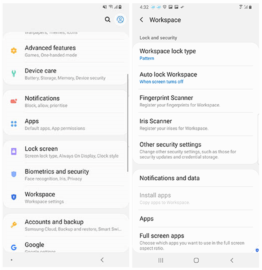
This UI change also affects where you manage your Knox settings. In previous versions (i.e – Knox 3.1), there is a separate ‘Knox settings’ icon inside the Workspace. This is no longer the case. With the new tabbed UI, Workspace settings are consolidated with the regular device settings on the personal side. This makes it easier for you to manage and review your preferences all at once, instead of having to go back and forth between separate menus.
To access your settings, go to Settings > Workspace. This image below shows what they look like now.
For more information
- More Workspace changes in Android P: See Knox Platform for Enterprise Admin guide > About Knox Workspace.
- General information: See Knox Platform for Enterprise Admin guide.


